An Eight-Year-Old Designed My Album Cover. It Outperformed Everything Else I've Released.
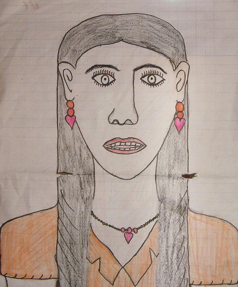
Photo: Khamkhoune at 11 years old (contact Basile Morin), CC BY-SA 4.0, via Wikimedia Commons
I've stared down blank canvases, dead laptop batteries, and one particularly hostile open mic in Toledo. None of it prepared me for the specific flavor of terror that comes from handing your album cover—the face your music wears in a thumbnail the size of a postage stamp—to a second grader.
But that's exactly what I did last spring, and I'd do it again tomorrow. Let me tell you how we got there.
The Brief That Broke Me
Every cover I'd ever made followed the same tired formula: moody photo, desaturated filter, my name in a font I'd spent three hours choosing. They were fine. They were safe. They were also, if I'm being honest, invisible.
I'd been sitting on a batch of songs for months because I couldn't crack the artwork. Every mockup felt like a costume. Then my sister-in-law, who teaches art at a K-8 school outside Dayton, mentioned her students were doing a unit on "album covers as storytelling." She asked, half-joking, if I had anything they could look at.
I had eleven unfinished covers. I sent her one song and zero instructions.
The Competition
Here's how it went down: twenty-six kids, ages seven through ten, listened to a ninety-second clip of a song called "Porch Light." Their only assignment was to draw what it looked like. Not what I looked like. Not what an album was "supposed" to look like. What it looked like.
The results came back on construction paper. There was a house floating in a purple sky. A dog with wings. A stick figure crying blue rain that turned into musical notes. And then there was Priya's.
Priya, age eight, drew a single yellow porch light glowing in a sea of black crayon, with a tiny silhouette walking toward it. No filter. No font anxiety. No second-guessing. Just the emotional core of the song, rendered in wax crayon by someone who'd never heard the phrase "brand identity."
It wrecked me. It was better than anything I'd made.
The Fallout (the Good Kind)
I want to be clear: I did not make this decision casually. I sat with Priya's drawing for two weeks before I committed. I ran it past my booking agent, who said it was "bold." I ran it past my drummer, who said nothing and just laughed, which in drummer language means approval.
When "Porch Light" dropped with a crayon drawing as its cover, the internet had opinions:
- The fans loved it. Comments ranged from "this is the most honest cover I've seen all year" to "my kid could do that"—and here's the thing, that second comment was a compliment in context, because I'd told the whole story upfront.
- The numbers didn't lie. In the first month, "Porch Light" outperformed my previous three singles combined on streaming. Playlist curators who'd ignored me for years added it. I can't prove the cover did it, but I can tell you the cover is what made people click.
- One person was furious. A Reddit thread accused me of "stunt marketing." Fair. It was a stunt in the sense that everything honest is a stunt now.
Priya's original drawing now hangs framed above my mixing desk, right next to the gold record I don't have. Her school got a check for their art program. Her parents got a lifetime pass to my shows. Priya got a thank-you drawing from me, which she reportedly graded "a B-minus, needs more color."
Correct, Priya. It does.
What It Taught Me About Ego
Here's the uncomfortable truth the whole episode surfaced: my album covers were never really about the music. They were about proving I was a Serious Artist Who Does Everything Myself. The crayon cover worked because it had nothing to prove.
Audiences don't connect with polish. They connect with feeling. An eight-year-old with a box of Crayola understood the assignment better than I did because she wasn't trying to impress anyone. She was just listening.
A Short Guide to Collaborating With Unexpected Audiences
If any of this resonates and you want to try something similar, here's what I learned the hard way:
- Give a prompt, not a brief. "Draw what this sounds like" beats a 40-page brand guide every time. Constraints kill the magic you're actually looking for.
- Get consent squared away. I had signed permission from Priya's parents and the school before anything went public, and I paid the art program. Do not skip this step. Ever.
- Pick the winner blindly if you can. I ranked the drawings before I knew any names. It kept my relationships with all twenty-six kids clean.
- Tell the story yourself, first. The cover worked because I explained it on release day. Letting people "discover" the origin later reads as gimmick. Owning it upfront reads as intention.
- Frame the original. Not for the aesthetic. As a reminder. The best creative decision of my career was made by someone who still loses teeth for a living.
The next album's cover is already done, by the way. A fifth grader named Marcus drew it. It's a T. rex holding a banjo.
It's perfect. I wouldn't change a thing.